Significant declines have been documented in Maui’s near-shore reefs. Declining water quality, particularly due to human activity, is thought to be a significant factor. The State of Hawai`i Department of Health (HIDOH), Clean Water Branch (CWB) has been collecting and analyzing water samples collected from various sites around Maui on an intermittent basis. The Clean Water Branch maintains a web portal where much of this data can be accessed and downloaded by the public. Due to the sheer volume of data available, over 19,000 records spanning a period of over 43 years, it has been difficult for interested persons to extract useful interpretations of this mass of data.
In our recent scientific paper, The influence of wastewater discharge on water quality in Hawai’i: A comparative study for Lahaina and Kihei, Maui, we chose to focus on a subset of the available data, limiting our analysis to the western shores of Maui during years with sufficient data collection for the most important nutrients. We summarize our findings below and also provide some interactive maps and supplementary information.
- Appendix A – Temporal Analysis
- Appendix B – QIP Calculation Methods
- Appendix C – Geometric Mean Table
We found similarities and differences compared to the official assessments reported by the Hawai`i Department of Health (HIDOH). For your convenience we provide links to the official HIDOH reports and we created interactive maps where you can compare their results with ours.
In a forthcoming paper, currently being written, we use similar techniques as in our paper above to provide a summary of ALL available data for ALL Maui sites and for extended time periods. In particular we will compare two 5-year time periods 1993-1997 and 2011-2015, looking for trends and considering possible influencing factors. Look for it later this spring.
A Visual Overview
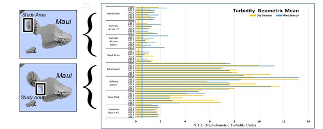
Only eight sites (four sites near the Lahaina WWRF and four sites near the Kihei WWRF) had nutrient concentration data for ≥ 4 consecutive years (2009–2015). We calculated a special kind of average, called the geometric mean, for the measured concentrations and plotted them in a bar chart. In these charts, the four sites near the Lahaina Wastewater Reclamation Facility (WWRF) are at the top and the 4 sites near the Kihei WWRF are near the bottom.
The vertical lines show the statutory limit, to the left of the vertical line the water is below the limit and is considered suitable for its intended purpose, such as swimming and surfing. To the right of the vertical line the water is considered ‘impacted’ and it is in violation of State water quality standards. The blue lines are for the wet season (November through April) and the tan lines are for the dry season (May through October).
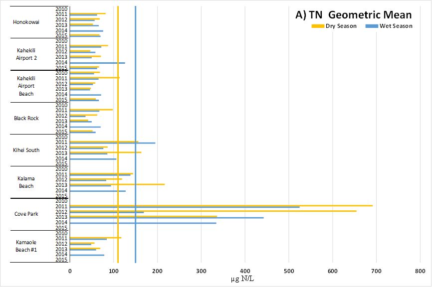 Total Nitrogen Geometric Mean. The government standard is 110 for the dry season, and 150 for the wet season.
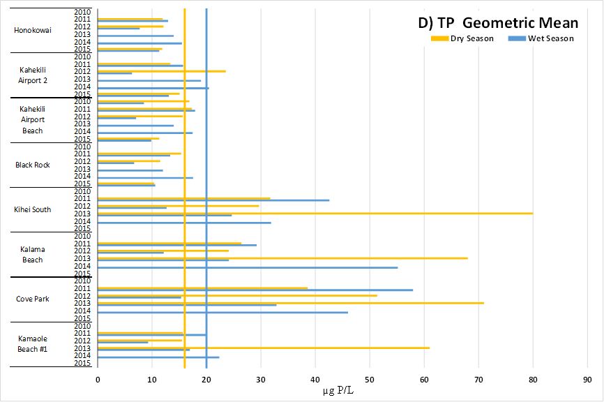 Total Phosphorus Geometric Mean. The government standard is 16 for the dry season, and 20 for the wet season.
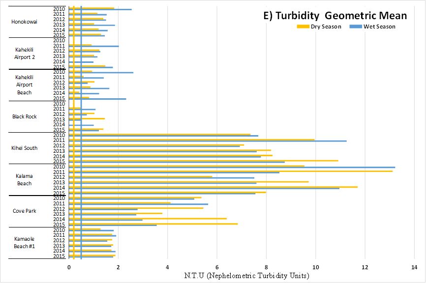 Turbidity Geometric Mean. The government standard is 0.2 for the dry season, and 0.5 for the wet season.
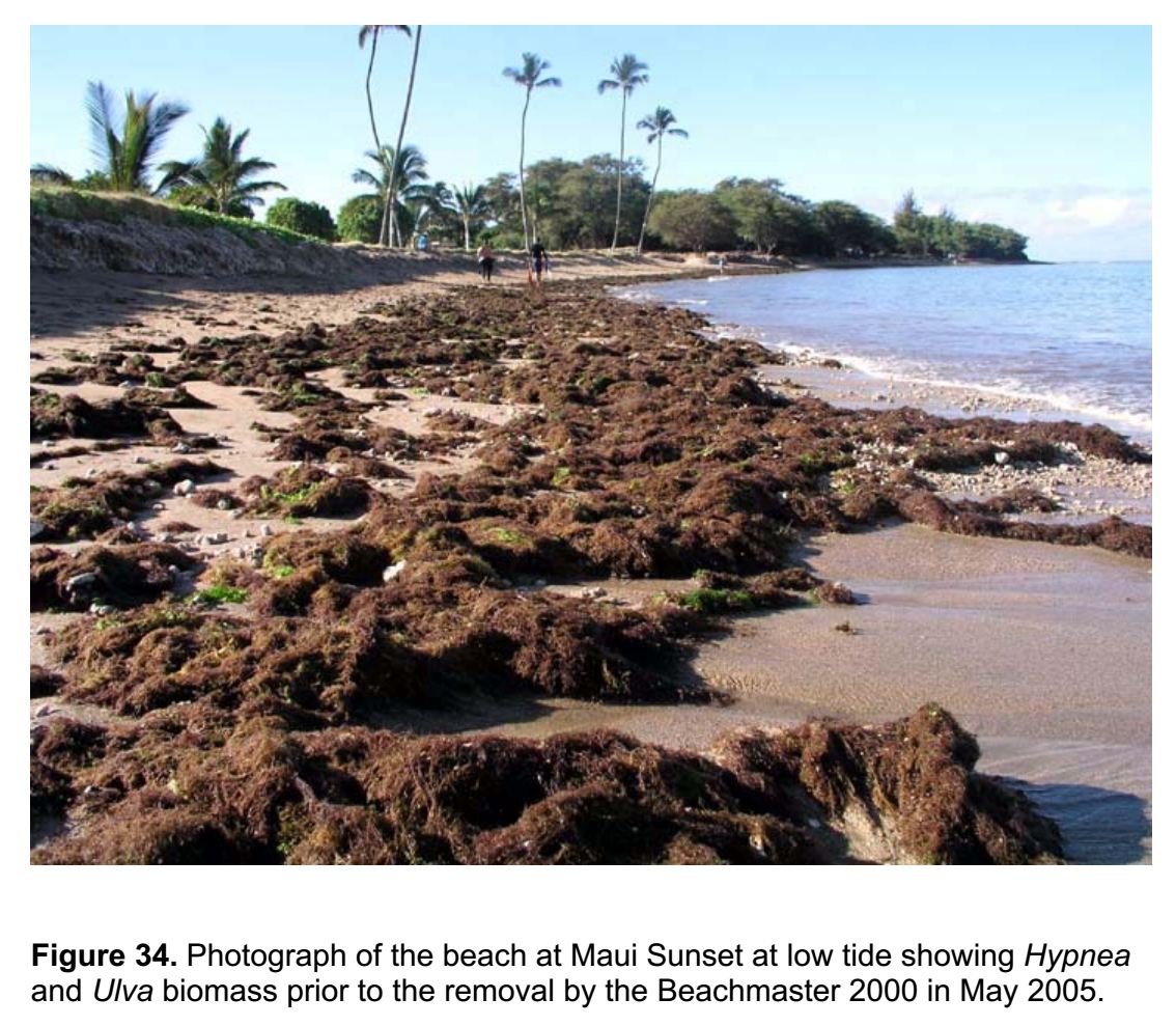
Concentrations of Nitrogen and Phosphorus are particularly relevant because at high concentrations they can cause invasive algae to flourish. A recent study funded by the County of Maiu found that explosive algae growth is associated with high nutrient environments in North Kihei (photo below).
Maui’s coral reefs are in poor health and their health is continuing to decline. A recent report published by the Maui Nui Marine Resource Council provides a brief summary of the many factors involved. One of the major factors is the addition of dissolved nutrients such as Nitrogen and Phosphorus into near-shore waters. Runoff from landscape fertilizers is one familiar source, but most people do not realize that millions of tons of nutrients per year are injected into shallow wells then make their way to the ocean nearby.
Between 1997 and 2008, the County of Maui disposed of about 51 billion gallons of partially treated effluent, including 3.8 million lbs. of nitrogen (equivalent to about 1,000,000 bags of lawn fertilizer), into injection wells connected to the nearshore environment. Effluent plumes from the Lahaina Wastewater Reclamation Facility (WWRF) and the Kihei WWRF have been extensively studied. The images below show the plume extent for each facility.
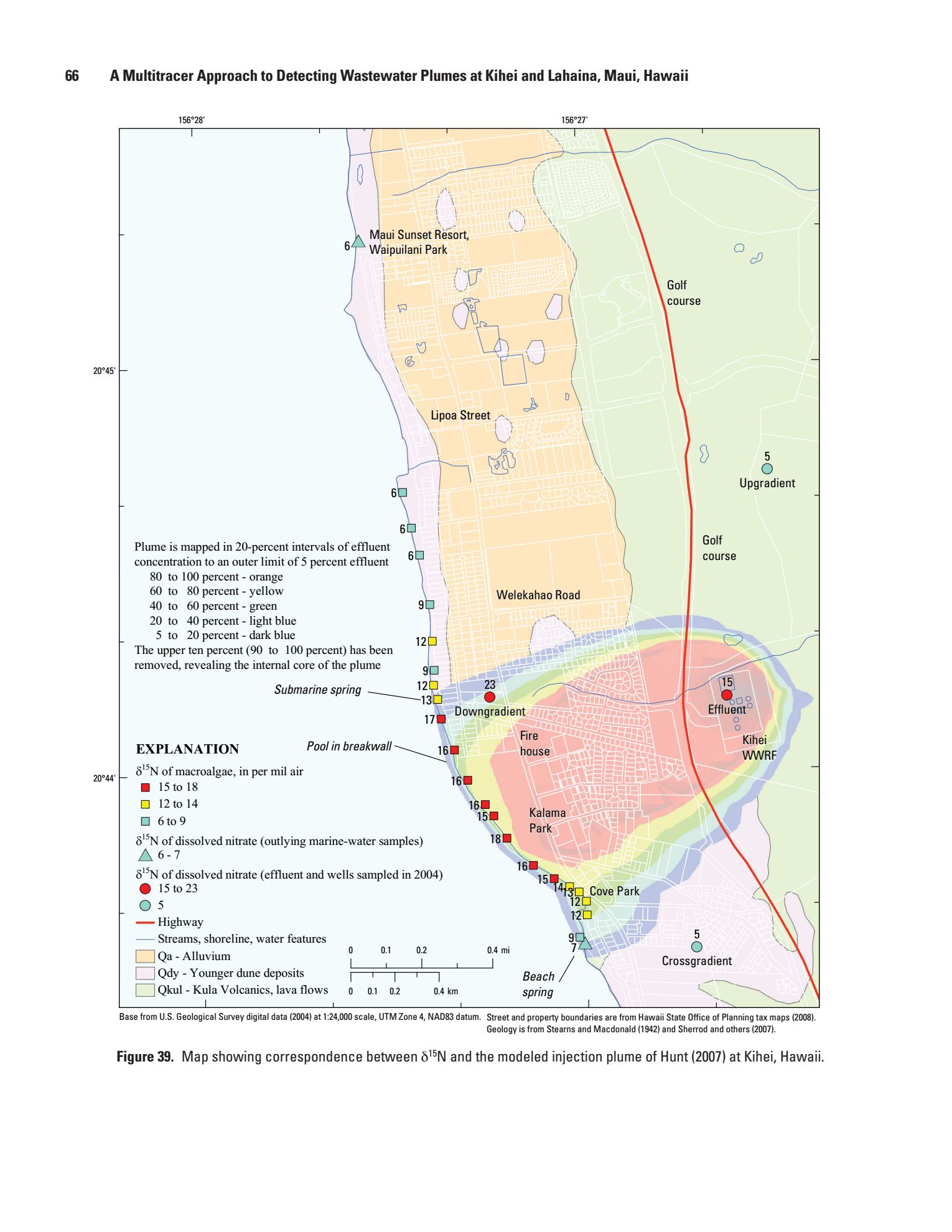 Figure 39 from Hunt and Rosa 2009 USGS Tracer Study
 Figure 40 from Hunt and Rosa 2009 USGS Tracer Study
As you might expect, at beaches where the wastewater effluent resurfaces and mixes with the ocean, water samples are consistently high for all nutrient pollutants. As you move down-current, sites test lower for the nutrients. This is partly due to dilution with seawater, and partly because aquatic algae rapidly remove dissolved nutrients from their environment. Elevated nutrient levels often give rise to algae blooms, sometimes with costly and devastating effects. Ma`alaea reef was vibrantly healthy as late as 1993. Photo below courtesy of The Hawai`i Division of Aquatic Resources (DAR) & Hawai`i Coral Reef Initiative Research Program.
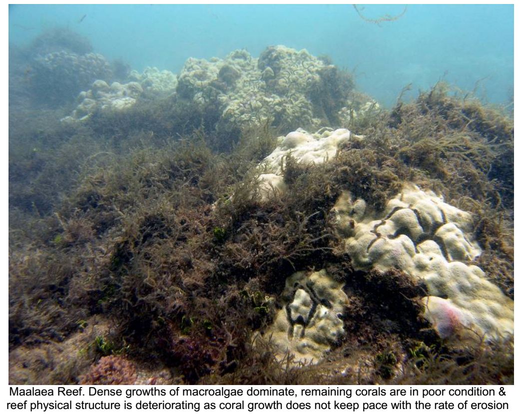 Image source DAR Status of Maui’s Coral Reef
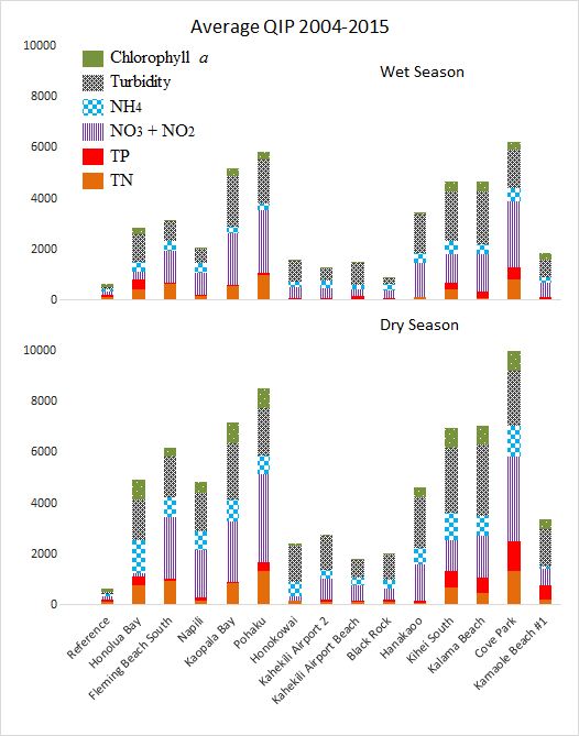
Qualitative Impact Percentage
Our paper introduces the Qualitative Impact Percentage (QIP) which is a novel way of comparing the relative impact of different pollutants. The chart below shows QIP values averaged across all years (2004-2014) for each site for the wet season (top graph) and the dry season (bottom graph). The reference QIP bar shows what a site would look like if it was suffering maximum impact yet still attaining water quality standards by the slimmest margin. For example, Honokowai in the wet season is very close to meeting WQS for all variables except for turbidity.
Use the interactive map below to quickly access relevant data for sites of interest. Different subsets of data can be turned on or off as desired. Clicking on a marker will open a small window displaying detailed data specific to that site. The specific data will be different for each map layer.
View Average QIP 2004-2015 Map in a full screen window
This following spreadsheet contains the full set of data used for each map and the QIP chart above. Open the QIP Fig 3 spreadsheet to be able to sort any column in ascending or descending order by clicking on a column header.
Appendix A — Temporal Analysis
Appendix B — QIP Calculation Methods
Appendix C — Geometric Mean Table
Official HIDOH Water Quality Reports to Congress – along with QIP values and interactive maps