What is a QIP and How is it Calculated?
A Case Study
Suppose you have 10 water samples and you’ve measured the Total Nitrogen (TN) and Total Phosphorus (TP) concentrations. You know that pollution is a problem but you want to know which nutrient is the bigger problem. Federal and State agencies have established standards for water quality, but which nutrient is having a bigger impact? And relatively speaking, how big is the impact? The samples were collected over an entire year, and in that time the water quality has varied due to a whole host of reasons. The traditional methods of calculating a mean and standard deviation would be invalid under these circumstances because those methods have an underlying assumption that the samples were drawn from a body of water that has stayed the same. A different method is called for.
The Qualitative Impact Percentage (QIP) provides a way to answer these questions. The measurements for each nutrient are compared to their associated standards in a way that gives a numerical percentage for how well they meet the standard. Percentages are unit-less, so you can directly compare the percentage for TN against the percentage for TP to get a relative sense of their degree of impact. These percentages give a qualitative gauge for degree of impact, hence the name Qualitative Impact Percentage.
The 10 measurements for TN and TP are shown in the table and charts below. The first thing we do is calculate a certain kind of average value for each nutrient. Then we count up how many measurements fall within certain ranges. The ranges we use are determined by the applicable water quality standards. Then we calculate ratios based on how many measurements fall in each range. The details will be covered below, for now this is just an overview. Finally, we end up with a single number, a percentage we call a QIP, that gives us a measure for how well or how badly the measurements conform to the standards. For our example, can you tell which nutrient has a bigger relative impact on water quality? We’ll return to this example near the bottom of this page and see how the QIPs compare.
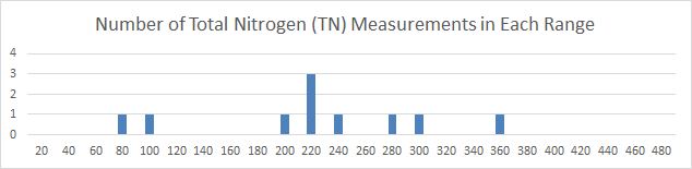
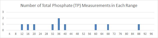 Histogram of 10 Measurement Values These charts show the number of measurements falling into the specified bin, or range of values. The bin size for TN is 20, the bin size for TP is 4. For example, for TN there was one measurement in the range of 61 to 80, and another measurement in the range of 81 to 100. For TP, there were two measurements falling in the range of 33 to 36.
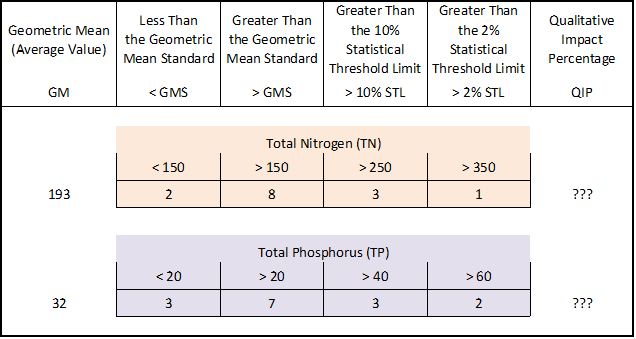 Comparing the Measurements to the Standards Comparing the histogram of measurements to the standards for each pollutant yields the numbers shown in this table. The standards for TN and TP are both specified in μg N/L. From this wealth of detail can you tell which pollutant has the bigger impact? And if so, how would you explain it to your neighbor?
What if we also want to consider turbidity? How do we do an apples-to-apples comparison of its impact compared to the others? Turbidity is measured in Nephelometric Turbidity Units (NTU), not in μg N/L like TN and TP. QIPs comparisons between pollutants measured in different units become easy since QIPs are percentages and have no units.
Perhaps more important is the convenience of using QIP to monitor and compare pollution levels at distant locations. To get a composite view you can average the QIPs for multiple pollutants at each location. This can give you a quick easy way to gain a high-level understand of spatial and temporal trends.
Scientists and water quality experts will probably have little use for QIPs since they already know what a given measurement means for each of these pollutants. For the general public and policymakers who need a minimum of detail, they could use QIPs to help understand which beaches are worse and by how much. For those of us who care about cleaning up polluted water, we are finding that public support is essential in creating the mandate for change. Reducing barriers to public understanding of water quality issues may help increase public involvement and support.
Traditional Statistical Treatment of Data
The typical way to characterize the pollution levels in a body of water is to take numerous independent samples and calculate the statistical mean and variance of the measurements obtained. If you collect a large number samples and plot a histogram of the measurements you would begin to see the infamous bell-shaped curve. The highest point of the curve would be the mean value, also called the expected value. The variance in the measured values determines the width of the bell shape. The variance is often discussed in terms of a calculated standard deviation.
 Example Bell Curves In this population of 20-year olds, the expected value, also called the mean value, for the height of men is about 71 inches, and for women is about 65 inches. Men have greater variance in the expected value compared women, the standard deviation for men would be larger than for women.
The sparse data available to us from the Clean Water Branch does not lend itself to the calculation of a bell-shaped curve. There is rarely more than one sample per month so it would take several months or a year before there are enough samples collected to even begin looking for a mean and variance. The problem is, to calculate a valid mean and standard deviation there is an underlying assumption that all samples are drawn from a population that has a common mean and variance. In other words, all samples would have to be dipped from essentially the same pool of water. For example, we would have to make the assumption that a single water sample collected at a site in January and a single water sample collected at that same site in July came from a pool of water with exactly the same pollution level (the same mean and variance). If the water at Cove Park is substantially the same from month to month then this assumption may be close to being met, but there would be no way for us to be confident one way or the other. The only way to gain confidence in the measured pollution levels is to collect many samples, at least 10 or more, at the same site all within a few days, depending on how rapidly the water conditions may be changing.
At sites subject to seasonal fluctuation, the assumption of a uniform population of samples is not met. For example, during the high season of tourism there is more wastewater pumped into injection wells. Near Lahaina it takes as little as 3 months for that water to percolate into the area used by snorkelers [Glenn et al. 2012]. It would be hazardous to assume that water samples collected there from month to month come from a pool of water possessing the same statistical properties. Runoff from construction sites or rainfall events could also cause large fluctuations.
The Qualitative Impact Percentage
A different way to interpret the available data is to compare the measurements to a known statistical distribution and get a feel for how well they fit. Fortunately, state and federal water quality standards provide us with a statistical distribution we can compare our sparse data against. This distribution is provided in the form of three points. The first point is a measure of central tendency, which corresponds to the mean value or expectation value discussed above. The other two points give us limits on the acceptable variance or degree of spread in the data. The Geometrical Mean Standard (GMS) corresponds to the mean, and the average value of the measurements (computed as a geometric mean) must be lower than the GMS for the water to attain compliance with the standard. The 10% and 2% Statistical Threshold Values (STVs) give us a way to measure the variance.
For example, out of 50 samples no more than 10% of the measurements (5 samples) are allowed to exceed the 10% STV for the standard to be met. Likewise, if more than 2% of the measurements (more than 1 of the 50 samples) are greater than the 2% STV then the standard has been exceeded. In the charts below, the GMS and the two STVs are depicted by vertical lines. You can count the number of measurements appearing to the right of each STV line to see if that standard has been met or not. To see if the GMS has been met or not you plot the geometric mean of the set of measurements and see if it is on the left of the GMS line (standard is attained) or if it is on the right (standard is exceeded).
An added strength of this technique is that it gives us a way to meaningfully compare the impact of different pollutants at the same or different sites. If pollutant A exceeds its standard and has a QIP of 200 at site 1 and pollutant B exceeds its standard and has a QIP of 400 at site 2, then we know that relatively speaking, pollutant B is the bigger offender since lower QIPs are better. For example, without using QIPs you might not realize that a TN geometric mean of 300 μg N/L is relatively less polluted than a TP geometric mean of 80 μg N/L. Using QIPs county officials and facility managers can have a better idea of how to apply their efforts to get the best results.
Visualizing QIP Calculations with Examples
The chart below shows an idealized set of water quality measurements for Total Nitrogen taken from a relatively clean body of water that easily meets State standards. The height of each green bar represents the number of samples having a measurement within a certain range of values. Each bar is 20 units wide. For example, there were 6 samples that measured between 50 and 70 units of Total Nitrogen, and there was a single sample measuring between 350 and 370 units. The Hawai`i Geometric Mean Standard for Total Nitrogen in coastal waters during the wet season is 150 units. The 10% STV is 250 units and the 2% STV is 350 units. These standards are shown as vertical lines.
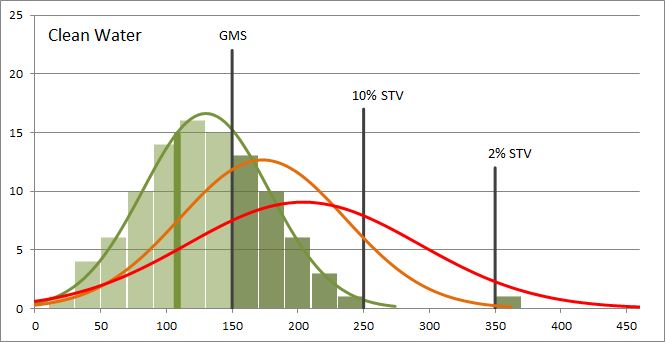 Clean Water Histogram The height of each bar represents the number of samples in a given range. Bars to the right of the Geometric Mean Standard are shaded darker and represent measurements that exceed the GMS. For this set of samples, the geometric mean is 108 units and it is indicated by a thick vertical line. There are 34 samples with measurements greater than the GMS. There is 1 measurement greater than the 10% STV and 1 measurement greater than the 2% STV. This set of samples has a QIP of 50 (calculated at the bottom of the page).
The next chart shows idealized data for a body of water that barely meets State standards.
 Borderline Water Histogram The geometric mean is 150 units, indicated by the thick vertical line that partially overlaps the black GMS line. There are 65 samples with measurements greater than the GMS, they are indicated by the darker bars. There are 12 measurements greater than the 10% STV and 1 measurement greater than the 2% STV. This set of samples has a QIP of 100.
The last chart shows idealized data for a body of polluted water.
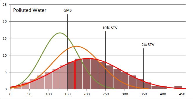 Polluted Water Histogram The geometric mean is 169 units and is indicated by the vertical red line. There are 73 samples with measurements greater than the GMS (darker bars). There are 30 measurements greater than the 10% STV and 5 measurements greater than the 2% STV. This set of samples has a QIP of 200. Note that the polluted water has a much wider variance than the clean water.
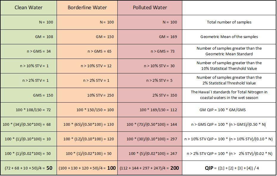
Calculating the QIP
A single QIP value for a set of measurements is the average of 4 sub-factors:
- The ratio of the geometric mean to the standard
- The ratio of the number of measurements greater than the standard
- The ratio of the number of measurements greater than the 10% threshold limit
- The ratio of the number of measurements greater than the 2% threshold limit
Abbreviations:
| GM | Geometric Mean of a set of measurements (see how to calculate it here) |
| GMS | Geometric Mean Standard determined by state regulations |
| 10% STV | Statistical Threshold Value, only 10% of the samples can be above this value |
| 2% STV | Statistical Threshold Value, only 2% of the samples can be above this value |
| N | The total number of samples |
| n | A subset of samples, such as those greater than a certain value |
Formulas and Calculations
| QIP Sub-Factor | Formula | |
| GM QIP = | 100 * GM / (GMS) | [1] |
| n > GMS QIP = | 100 * (n > GMS) / (0.50 * N) | [2] |
| n > 10% STV QIP = | 100 * (n > 10% STV) / (0.10 * N) | [3] |
| n > 2% STV QIP = | 100 * (n > 2% STV) / (0.02 * N) | [4] |
| QIP = | ([1] + [2] + [3] + [4]) / 4 | [5] |
The following table shows how the calculations are performed using the idealized samples shown in the charts above.
Using the techniques learned in this section, you should now be able to answer the question posed in the case study at the top of the page. Calculate the QIP for the TN example and compare it to the QIP for the TP example. The QIP for TN is 272 and the QIP for TP is 400. Are you surprised?
Footnote for Scientifically Minded People
To be scientifically rigorous, one could argue that for the data we’re working with, the underlying statistical distribution is probably log-normal and that we should log-transform everything before we do altered versions of the calculations described above. For example, as a reminder, the geometric mean is calculated as 10 to the power of the average of the logarithms of the measurement values. These arguments do have merit and we did consider doing things this way, creating some kind of log-QIP. Whatever advantages we would gain are minor compared to the disadvantages. Our primary goal for the QIP is to compare site A against site B. Using log-QIPs or standard QIPs wouldn’t make much difference, polluted sites would still stand out compared to clean ones. The formulas and diagrams above are hopefully something people can relate to in a way that helps the QIP numbers have meaning to them. In a log-transformed world people lose the ability to relate to the numbers – at least we do!
Footnote for Non-Scientifically Minded People
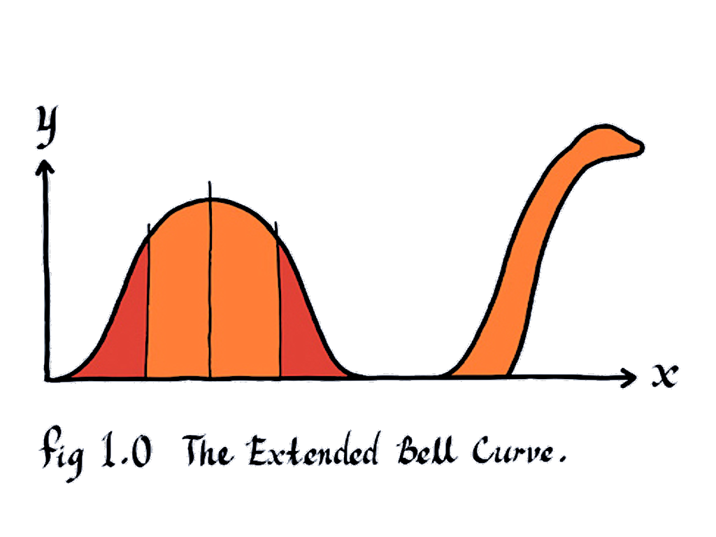
Someone suggested we use a special extension to the normal distribution shown below. We decided against this option. As far as we know, it may be applicable to only certain bodies of water in Scotland.